To speed up releases and keep every digital touchpoint consistent, WOM asked me to create a full design system from the ground up. Over four sprints I worked with two front-end developers and a brand designer to define tokens, components, and clear usage guidelines that fit both marketing pages and complex self-service flows.
The Challenge
Teams were reinventing UI patterns on every project—slowing delivery and breaking brand consistency.
1. No single source of truth: colors, fonts, and spacing varied across sites and apps.
2. Duplicate components: buttons, forms, and cards were rebuilt in Figma and code, wasting time and causing visual drift.
3. On-boarding pain: new designers and developers spent days hunting for the “right” styles instead of building features.
The Solution
We created a token-driven library that serves design and code equally.
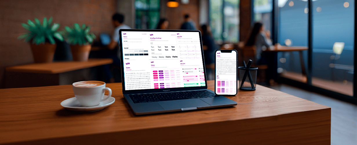
1. Foundation first: defined color palette, 8-pt spacing scale, typography ramp, and elevation levels as tokens exported to Figma and Sass.
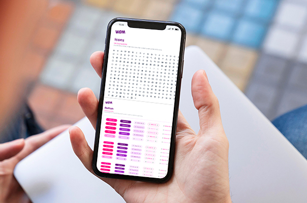
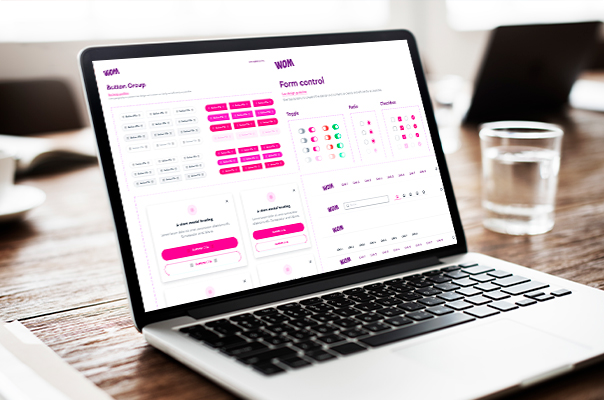
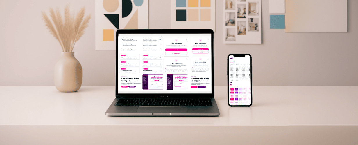
2. 40+ reusable components: buttons, inputs, cards, modals, tables, and status badges—each with states, accessibility notes, and responsive rules.
3. Zero-height documentation: live Storybook with guidelines, do/don’t examples, and copy snippets; linked directly from Confluence.
Project Result
Consistency improved and build time dropped across squads.
1. UI bug reports fell 35 % within two months of adoption.
2. Average feature hand-off time shrank from 3 days to 1 day thanks to ready-made components.
3. New-hire ramp-up dropped from two weeks of “where is the style?” to four days with the documented library.
Project Result
Conclusion: By turning scattered styles into a single, token-based design system, we gave every WOM team a shared language—cutting rework, boosting brand trust, and freeing people to focus on new features instead of pixel policing.