WOM asked our cross-functional squad to fix a checkout that felt more like a form marathon than a quick purchase. I led UX strategy and UI design alongside a Scrum Master, Product Owner, and two developers, working in weekly sprints.
The Challenge
A single, overloaded screen confused shoppers and pushed many to quit before paying.
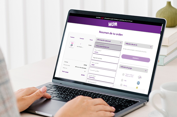
1. All details—plan, delivery, contact info, payment—lived on one crowded screen with no visual hierarchy.
2. Users faced long blocks of fields, some optional but unlabeled, making the flow feel messy and risky.
3. Extra questions (e.g., alternate phone, second address) slowed people down and spiked abandonments.
The Solution
We turned the clutter into a short, guided flow that only asks what’s really needed.
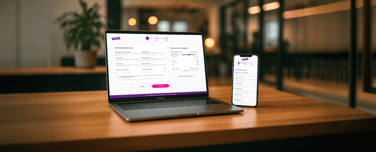
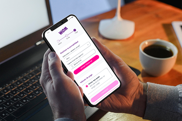
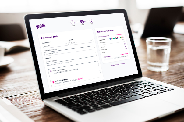
1. Broke the process into three clear steps: Personal information ▸ Shipping method ▸ Pay, with a progress bar for reassurance.
2. Trimmed or auto-filled fields: kept essentials, moved extras to account settings later.
3. Added an order summary that updates in real time, so costs and data limits stay visible.
Project Result
A smoother path meant happier customers and better numbers for the business.
1. Checkout time dropped from ~6 min to under 2 min.
2. Abandonment at the old “everything-on-one-screen” stage fell by 25 % in the first month
3. Support tickets about “can’t finish purchase” fell noticeably, freeing agents for higher-value calls.
Project Result
By turning an overwhelming screen into a simple three-step journey, we helped WOM convert more visitors into paying customers—no extra clicks, just a clearer way to finish the purchase.