WOM asked us to turn a cluttered, promo-heavy phone page into a clear purchase path. Over three sprints I led UX / UI, partnering with one developer and a copywriter, to reorganize content, highlight buying options, and raise conversion.
The Challenge
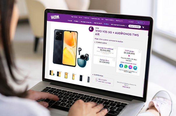
An overload of elements—and no visual hierarchy—left shoppers confused.
1. Everything competed for attention: hero image, price cards, promos, SIM info, and network badges all crammed above the fold.
2. Purchase options scattered: color selector, storage chips, and plan prices sat in different sections, forcing back-and-forth scroll.
3. Dense layout: little white space and mismatched font sizes made it hard to scan key specs, hurting confidence and conversions.
The Solution
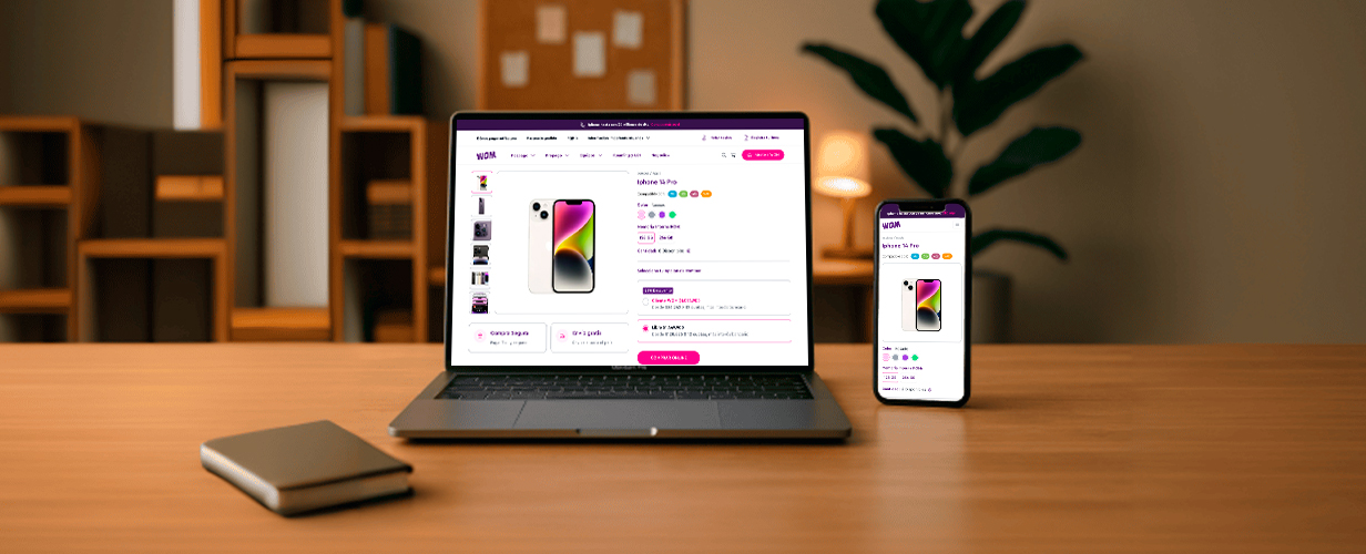
We rebuilt the page around a single decision flow that keeps key actions always visible.
1. Two-column hero: swipeable image gallery left; sticky buy module right with price, plan toggle, color dots, storage chips, stock, and CTA.
2. Inline payment breakdown: banner shows full price vs. monthly installments at a glance.
3. Visual hierarchy upgrade: consistent typography scale, generous spacing, and trimmed promo badges so users spot essentials first.
Project Result
A cleaner story led to faster decisions and higher checkout starts.
3. Average time on page dropped from 3 : 10 min to 1 : 45 min—users found what they needed sooner.
Project Result
By stripping noise and structuring information into a gallery-specs-buy flow, the new page replaced frustration with clarity—turning interest into confident clicks without adding extra steps.