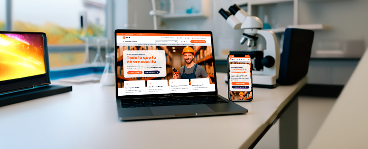
A hardware retailer asked me to craft the visual experience for its new B2B/B2C store. I delivered a responsive home page, category listing, and product-detail page each aligned to the brand palette and optimized for fast product discovery.
The Challenge
Turning a vast, utilitarian catalog into a branded, conversion-focused store presented three key hurdles:
1. Uninspiring identity, the visual style looked generic, giving shoppers little reason to trust or remember the brand.
2. Product findability issues, with thousands of SKUs, users struggled to filter and locate the exact drill bit or fastener they needed.
3. Missed cross sell opportunities, the product page layout buried accessory recommendations, limiting average order value.
The Solution
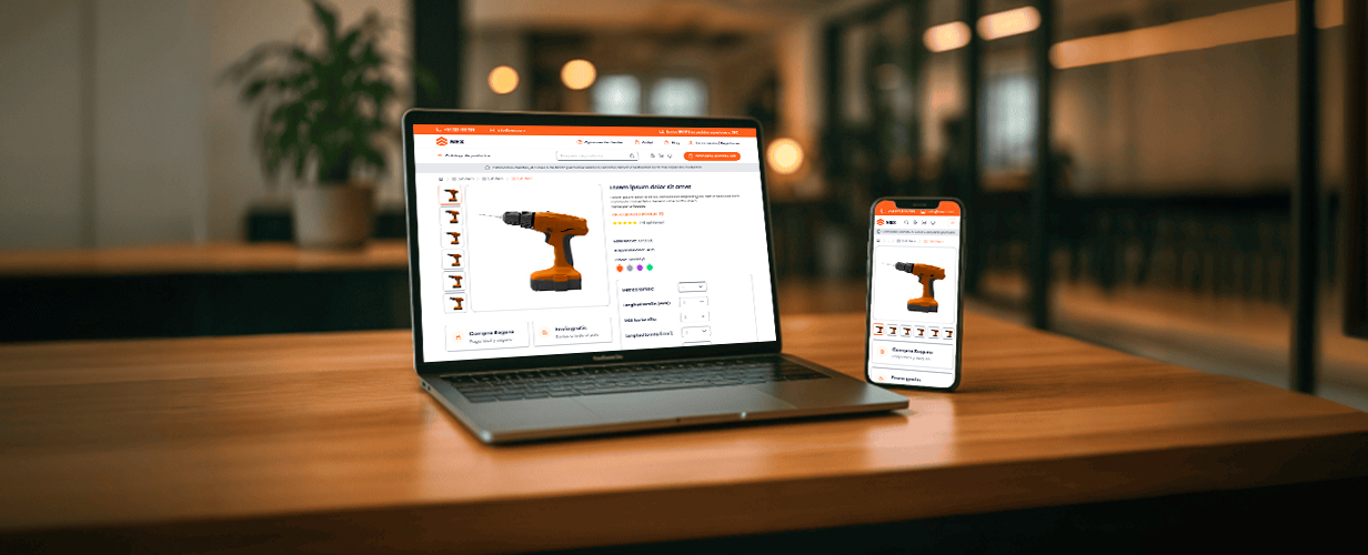
I built a clean, component based UI kit and applied it to the three key screens.
1. Home: Hero banner with value props and quick-link cards to drive traffic into top categories.
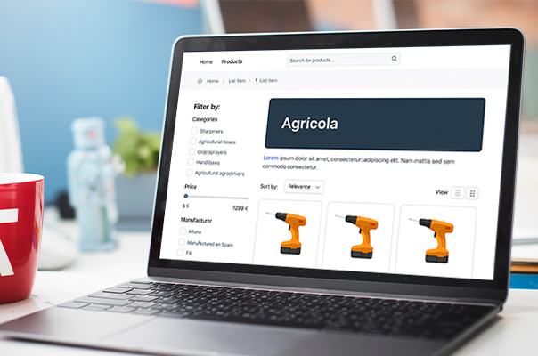
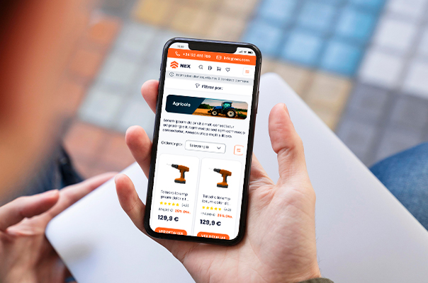
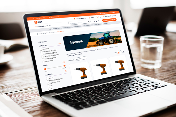
2. Category: Left rail filters, sticky on scroll, plus banner space for seasonal promos and an infinite scroll grid. Mobile layout collapses filters into a slide in drawer.
3. Product page: Modular gallery, clear variant selector, price box with trust badges, and a horizontal carousel of accessories that auto updates when the user changes a variant.
Project Result
The new design turned usability gains into concrete business benefits:
1. First usability test: 90 % of participants found a target item in < 30 s (vs. 75 s before).
2. Time on the product detail page dropped 40 %, while add-to-cart rate rose +18 % thanks to clearer specs.
3. Marketing reused the new hero and category banners in social ads, cutting creative lead time by one week per campaign.
Project Result
By combining a focused visual hierarchy with mobile first patterns, the new storefront turns a heavy industrial catalog into an easy, brand consistent shopping experience, helping both pros and hobbyists get the right tool in fewer clicks.